In an era of mostly-paperless law offices, making your own law firm letterhead as a document template can be a great way to save money, time, and paper resources while still presenting a professional appearance.
While you may have to use a commercial printer for business cards, you do not necessarily need a professionally-printed letterhead. If you already have a logo, you don’t even need a professionally-designed letterhead; you can just DIY. That’s not to say you should always use the cheaper, DIY solution. Many law firms in our Lawyerist Insider and Lawyerist Lab communities recognize the importance of investing in high-quality law firm marketing and client communications, but depending on your practice, law firm letterhead may be one area where a DIY approach is perfectly acceptable.
This is especially true when you consider that most correspondence never gets printed and a lot of correspondence does not go out on letterhead in the first place. This makes a DIY letterhead an increasingly defensible choice. Using resources like Typography for Lawyers, a few Microsoft Word tips, and perhaps a bit of well-placed graphic design help, you can design your own letterhead.
Designing Your Own Law Firm Letterhead
Here are step-by-step instructions for designing your own law firm letterhead in Microsoft Word, plus examples from Lawyerist readers who have done just that.
I collected samples of DIY law firm letterhead in the Lab, and I got a bunch of responses. If you want to see what is possible on your own, check out the submissions. While there was a lot of diversity (and creativity) among the contributions, several people showed their Word savvy by using headers.
Using the First-Page Header to Embed Letterhead Elements
If you want to make a letterhead template that’s both easy to use and difficult to accidentally screw up, you need to learn how headers work in Microsoft Word. Embedding all of the name and address information in the top of the document itself works fine as long as everyone who uses the template knows what they’re doing. In my view, though, it’s better to place that information out of harm’s way.
If you’re starting your letterhead template with a blank document (my recommendation), the first thing you’ll need to do is set up the document so that the first page has a distinct header from all the following pages.
The easiest way to do that is double-click into the header area (or, you can go to the Insert tab and choose Header > Blank) and then, in the contextual tab that pops up (named “Header/Footer Tools”), check the box next to Different First Page. This, obviously, will ensure that only the first page of your letter will have the firm name/logo, address, etc. (or at least the large version of them).
While you are in this contextual tab, you may want to make a decision about how far from the top of the paper you want your letterhead information to start appearing. By default, headers are 1/2 inch from the top edge of the paper. You may want to place your letterhead information a little higher, but if you’re actually planning on printing letters out, it may be wise to check to ensure your printer can actually deposit ink or toner that close to the edge of the paper.
The beauty of placing these elements into the header is that they stay safely separate from the text of the letter. You can always go back and change something in your letterhead template by double-clicking into the header, but there’s no danger of you accidentally backspacing over your phone number at the top, for example.
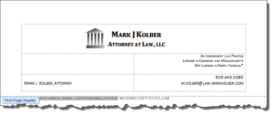
How you place those elements at the top is entirely up to you. For example, Mark J. Kolber placed his letterhead elements inside a table in the header, which is a really smart solution because it allowed him to place the address and other elements precisely:

If you’re more comfortable with columns or right-tabs or some other technique, however, that will work just as well.
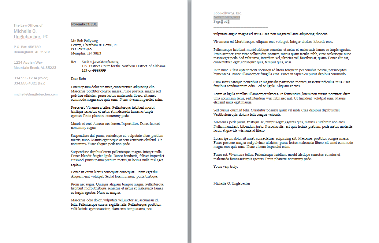
What a lot of people don’t realize, however, is that header elements don’t always have to appear at the top. Several of the sharpest-looking samples we saw in the Lab printed the firm name and address information along the left-hand edge of the paper.
You can use a technique involving embedding a text box inside the header and specifying its vertical and horizontal placement so that the letterhead information appears on the first page along the left-hand margin. The use of the text box technique also allows for embedding a logo file.
The law firm letterhead below has the same left margins throughout the document, but because the first-page text box is set up to have text wrapped around it, the text reverts to regular 1” margins on both left and right on the second and subsequent pages:

Getting Logos to Print Sharply
Because of the way Microsoft Word compresses image files, embedding logos requires a little extra work, especially if you plan on printing or exporting your law firm letterhead to Adobe Acrobat. You can instruct Word to not compress images contained in a document. When you finish creating your Word letterhead template, go to the File tab and click Options. Under Advanced, find the section called Image Size and Quality and check the box “Do not compress images in file” and make sure that “Set default target output to:” is set to the maximum DPI in the drop-down.
If you want to make this setting global (in other words, effective for all documents) and you are particularly tech-savvy and adventurous, you can modify a setting in the Windows Registry and never have to worry about this again. When I say “tech-savvy and adventurous,” I’m not kidding. Messing around with the Windows Registry is not for the faint of heart, because one slip-up can render your computer unusable. If you aren’t already comfortable with tasks like this, it’s better to get a professional to do it for you.
Originally published 2013-11-14. Revised 2015-06-14. Republished 2019-11-04.
Share Article
Last updated October 7th, 2022