The Lawyerist team has found the Best Law Firm Websites for 2022. We scoured the internet, put out a call to our community, and asked our partners for suggestions. First and foremost, we’d like to thank all the people who took the time to contribute to the list of nominees. As always, we had a stellar showing.
We wish we could take the time to talk about every one of the participants, as there were certainly special things in each site. Unfortunately, there is not enough time to do so. But, we did notice some trends among this batch that we’d like to highlight.
Key Features of 2022
Overall, the sites we reviewed focused on a client-centric experience. We found a lot of client portals, online payment processing, and online scheduling tools. There were also many firms trying to alleviate some of the anxiety of hiring an attorney by showing users the personality of their firm and giving them an idea of what it’s like to work with the firm.
The best of these client-centric websites usually had DIY or educational resources on their site. As you’ll see below, some sites built tools to help users solve their own issues, while others had bots that walked them through the beginning stages of their cases. At minimum, most sites had content to help their potential clients educate themselves about their issues.
Our team gave special attention to sites with a clear goal in their content marketing. Did the web pages direct users to a clear call to action? Many sites had an easy and constant “contact us” section leading users to either make a call, send a text, or fill out a web form. These sites understand that getting a user to your site isn’t enough; extra little steps can be the difference between a looker and a lead.
Take a look at the top ten Best Law Firm Websites for 2022 below and see what you think.
Best Law Firm Website Winners 2022
Stacy-Ann Taylor Law
By: PaperStreet Web Design
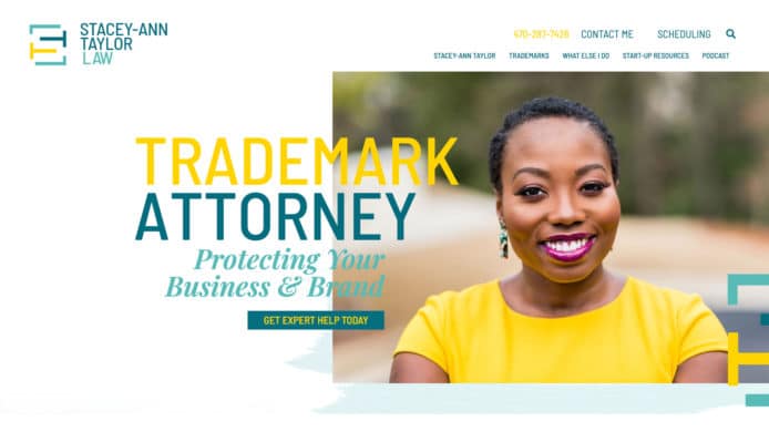
Stacy-Ann Taylor law is an excellent example of comprehensive and cohesive content marketing. The firm has multiple methods of engaging and drawing in potential new clients, including a podcast, robust blog, and specific resources for startups. Once on the site, there is a clear call to action to contact the firm directly.
Modern Wills
By: Modern Wills
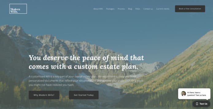
Modern Wills is probably the clearest example of client-centered content marketing in this list. The site gives ample educational resources to potential new clients and has a clear call to action. Although this approach is not for everyone, users can book an initial consultation with the firm directly from the website.
Pixel Law
By: Pixel Law
Pixel Law is sure of its ideal client. The look and feel of the website is geared towards tech-forward entrepreneurs and business owners. There are DIY educational resources on the site and a clear idea of who and how the firm helps.
The Champion Firm
By: Postali
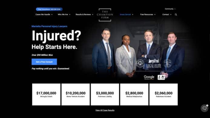
The Champion Firm knows it’s in a competitive market. It also knows converting viewers to leads is extremely important in the personal injury game. Here, we see a clear call to action, with multiple ways of contacting the firm. There is also a good deal of information about the types of cases users may be interested in when visiting. Importantly, though, the call to action and why you should choose The Champion Firm is always front and center.
OVB Law
By: Agency 6
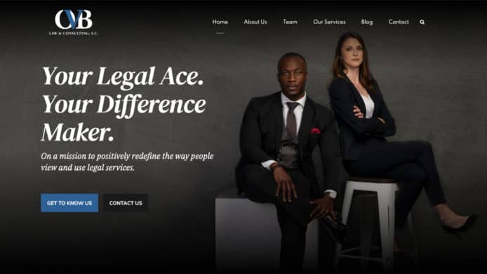
With OVB Law, we see a lot of personality. They are always showing their value to potential clients. Their word choices and images follow a clear theme—confidence and drive. Content marketing may not be as prevalent here, but the brand and personal voice stands out.
Mason PC
By: MGG Digital Consulting
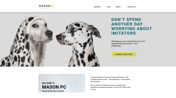
Mason PC is one of the best in the group at telling the viewer what they do without saying it. Their use of imaging to define their value proposition is excellent. More than anything, though, they have a clear call to action on each page that lets the potential new client schedule a consultation directly from their website.
As an added bonus, Mason PC has productized a portion of their offering. Although it is not built directly into the website, they offer DIY trademark services through their sister site, Markably.
Crouse Erickson Family Law
By: GNGF, LLC
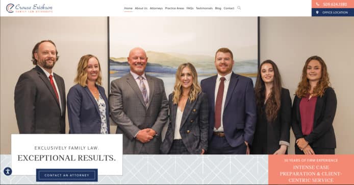
Crouse Erickson Family Law has a wonderfully easy site to navigate and has extensive content precisely geared toward its ideal client. Each page drives the user toward their call to action of “Contact an Attorney.” What’s more, the site is designed to highlight each attorney on the team while still promoting the collective. Small additions like testimonials for specific attorneys on their bio page add to the user’s level of connection.
Palace Law
By: GNGF, LLC (Website), Lawdroid (PatBot)
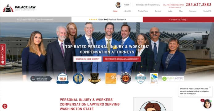
Palace Law ticks all the boxes with its workers’ compensation and personal injury website. It has a solid personality, promotes team values, and personalizes their team members. There is abundant educational information for the potential new client, and it has multiple methods of effectuating their call to action of “get a free consultation.”
However, what makes Palace Law stand out, is the interactive tool, PatBot. It can answer potential client questions, give a case assessment, and even help users with some DIY aspects of their case. Not only is Palace Law educating their potential clients, they are also adding real value and, likely, building a relationship.
Gilormo Injury Law
By: PaperStreet Web Design
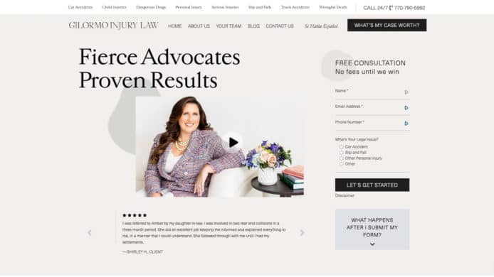
Gilormo Injury Law stands out because of its client-centered language and information. There is a lot of information about “what happens next.” Specifically, their main call to action is to book a free consultation using their web form. Next to that form is an explanation of what you can expect to happen after you submit the form.
Brown Glier Law
By: WSI
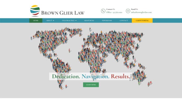
One knows what type of law Brown Glier Law practices without reading a word on the website. The imagery and branding is exceptional. However, potential clients who want to educate themselves, also have a wealth of information on their particular practice areas. What we like the most, though, is how Brown Glier presents their team to the potential new client. Yes, they have information about each individual, but they focus more on their team values and what it’s like to interact with this group of professionals.
Law Firm Website Inspiration
Want to learn more about how you can incorporate these ideas into your law firm’s website? Check out our Complete Guide to Marketing and Law Firm Websites. Just here looking for inspiration? Take a look at some of our previous winners below.

Share Article
Last updated January 25th, 2023
