Take a look at the winners of Lawyerist’s 2020 Best Law Firm Websites competition. See someone you know? Send them a congratulations. Think we’re missing someone great? Head over to the main page, and nominate them for the next Best Law Firm Websites contest.
1. LadyDUI
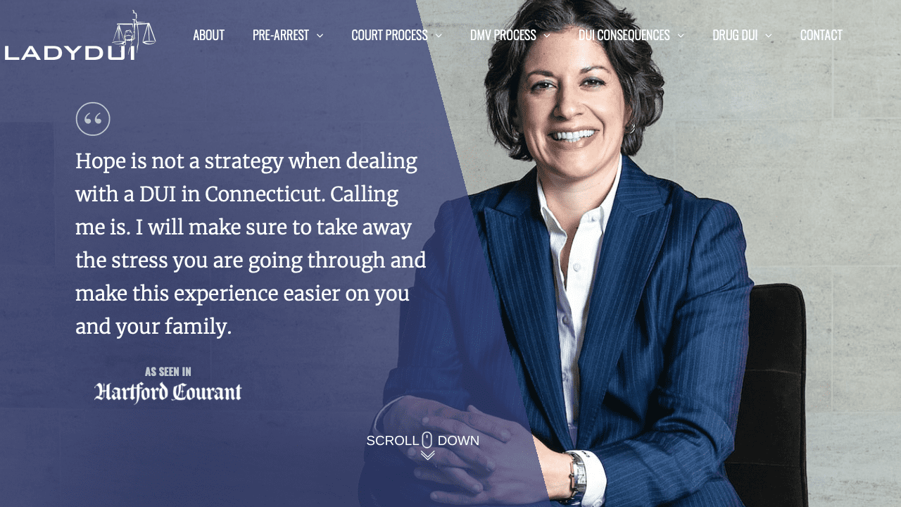
This website, for solo practitioner Teresa DiNardi, is a terrific example of how to use color and patterns to subtly pull everything together. The site is suffused with blues and purples, and DiNardi even makes her pinstriped suit part of the theme! Her call to action is front and center, letting a potential client know that reaching out will ease their stress. Add to that a judicious use of animation and a well-organized top menu broken down by stages of a DUI, and you have a website that draws the reader in with visuals and keeps them on the page with information.
LadyDUI’s site works especially well for a solo attorney where highlighting the attributes of one individual is key. The site makes DiNardi seem approachable while emphasizing her background and expertise. It’s a near-textbook example of how to market yourself when you’re a solo practitioner with your law firm website.
2. Dilworth IP
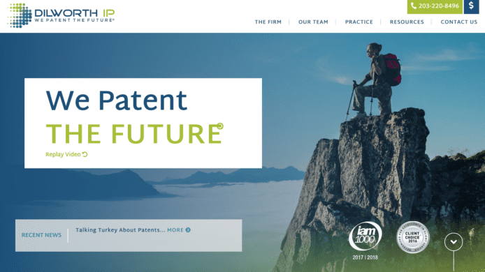
Dilworth IP’s introductory video makes its focus on technology visionary clients clear. The site offers potential clients both a vision—helping creators make a better tomorrow—and a promise to maintain the client’s trust. A “Recent News” banner on the front page draws the eye, and clicking leads to a blog that is frequently updated.
The site’s biography page is a bit generic, but gives ample space to non-attorney staff as well as the firm’s lawyers, which is something many firms overlook.
A list of industries Dilworth serves gets a bit too dense textually and would benefit from shortening the lists or another design element to break up the page, but that’s the only major flaw of the site.
3. Randal Lowry and Associates
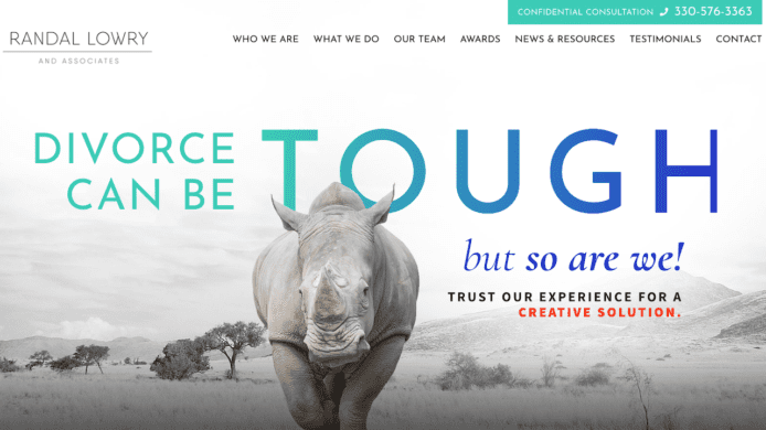
The tough-skinned rhino is a perfect visual for Randal Lowry and Associates, a family law firm that wants to project tenacity. The pop of teal and blue on the front page of the site carries throughout, getting picked up by the top menu as you scroll down the site. The typography—a mix of capital letters and cursive lowercase—is clean and the firm’s description of each practice area provides a sense of thoroughness to go along with the toughness.
While the visuals of the site are outstanding, the news portion of the “News and Resources” page is nearly empty. That’s a stark contrast to the resources portion, which has a detailed explanation of each stage of a divorce. The site would be better served with no news section at all if it’s left empty.
4. Levine, Blaszak, Block & Boothby, LLP
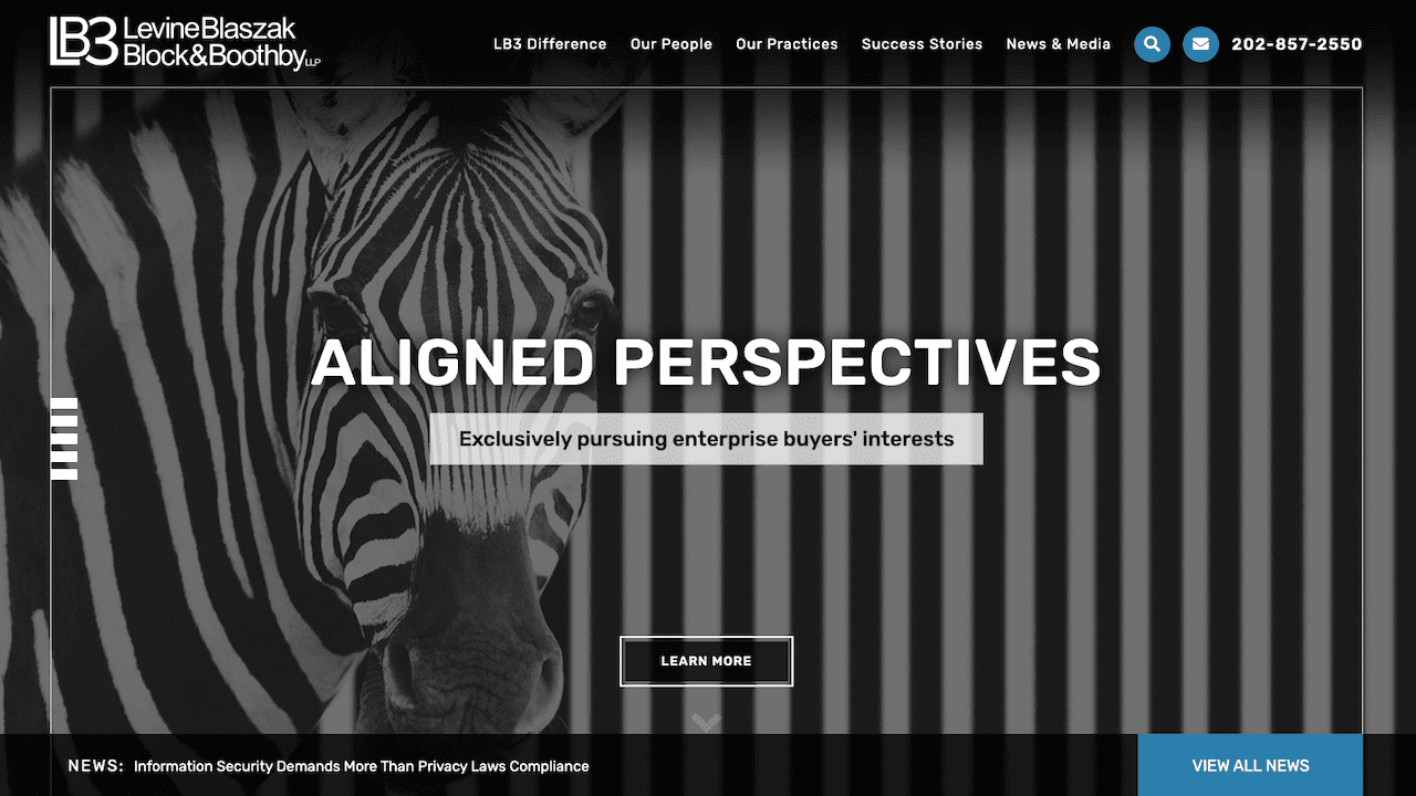
Levine, Blaszak, Block & Boothby, LLP is a communications and information technology law firm geared toward enterprise-scale clients, and it shows. The website is a solid example of how to do a good job marketing a highly-specialized niche practice. While it has great visuals for the front page, the site also leans heavily on promoting the expertise of the firm, including a detailed news section with podcasts, articles, and information on upcoming conferences.
There’s no question that promoting expertise is critical for a technology-focused firm like LB3, but the site can end up feeling a bit overwhelming. There are graphs of which industries they represent, attorney bios that run a bit too long, and a grey-on-grey section of recent success stories that feels like a wall of text. A few more visuals in place of lengthy text would enhance the site’s appeal.
5. Unorthodox Legal
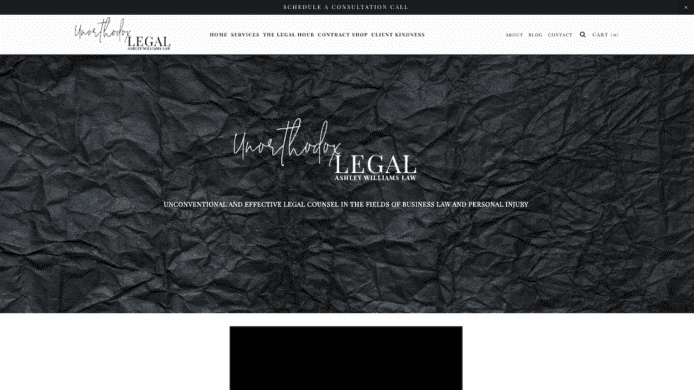
This site from Unorthodox Legal, a solo firm specializing in representing creatives, stands out for its minimalist design. The site is almost entirely in shades of black, grey, and white, but manages to still draw the eye.
Where the site really shines, though, is in the way the firm’s owner, Ashley Williams, packages her services. Williams provides a one-stop contract shop where clients can purchase a fixed-price agreement tailored to creatives, including a non-compete and some specialized service agreements for photographers and makeup artists.
In lieu of a blog, the site links to the firm’s Instagram. It’s a mix of inspirational quotes and brief legal tips. If Williams wasn’t clearly targeting young creatives, it might come across as a bit shallow, but it works well for this firm. However, the tight focus on this group makes Williams’ other practice area, personal injury, feel out of place here. It’s difficult to imagine a potential personal injury client feeling drawn in by the site.
6. Roth Private Advising Law
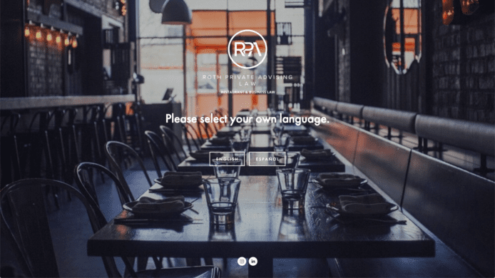
At first glance, the website for Roth Private Advising Law looks like you’ve stumbled onto a restaurant’s website instead. And that’s exactly the point. The firm focuses on representing restauranteurs, from choosing the proper business structure to complying with labor laws to generating franchise documents. The restaurant-themed visuals take what could have been a run-of-the-mill solo attorney website to a much more stylish level and likely make the firm seem accessible to potential restaurant business clients.
Unfortunately, font feels kind of generic and flat. So, too, is some of the copywriting, leaning a bit too hard on cliches like providing a “a whole new legal experience.”
The site is also missing a clear call to action. That’s likely because the front page of the website invites readers to choose between the English- and Spanish-language versions, but that front page should still make it clear how to contact the firm and why.
7. Lachtman Cohen
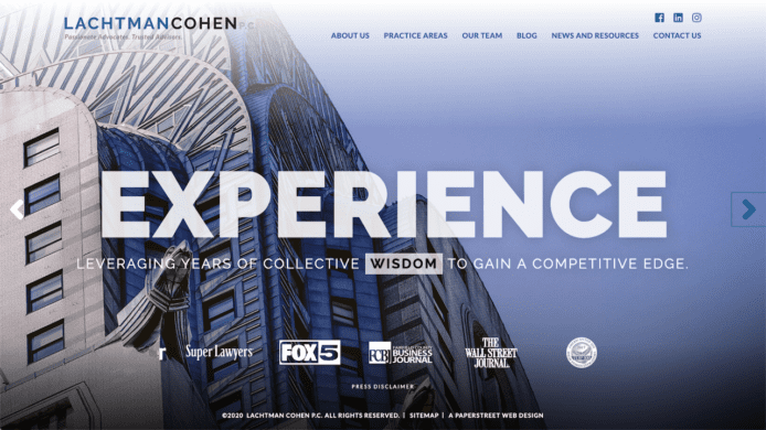
This East Coast-based firm went with some absolutely gorgeous photography for the front page of their site. There’s a soaring building, a swooping bridge, a pristine waterway carved through mountains. It’s a very visually appealing way for this real estate and business firm to present itself. Everything feels a bit larger than life, in a great way.
The firm has a lot of practice areas, but they keep the information in check thanks to a clean set of tiles that open to reveal a lengthier explanation of the area and which attorneys in the firm handle those matters.
The site falters when it comes to content marketing, however. The “News and Resources” section has only a few entries over the last several months. That lack of content can make a website look like it’s been abandoned. There’s a blog as well, but that takes the reader to an external site that is an old-school, text-heavy blog. Making potential clients leave your website to learn more about your firm is a dicey move, raising the possibility they might not come back.
8. Kraayeveld Law Offices
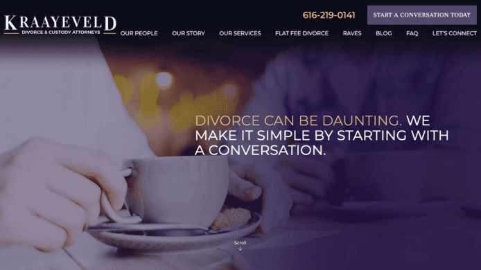
Family law firms can be tough to market, because no one wants to be seen as making light of such difficult issues. Kraayeveld neatly sidesteps this problem with a series of taglines that acknowledge divorce can be daunting and that custody battles can be complex but that above all, the firm will help the client navigate those problems. That’s reflected in the site’s call to action—”Start a Conversation Today”—as well.
Each of the site’s images also have a subtle but noticeable fade from dark to light, highlighting one portion of the photograph. It gives a sense of continuity to images that might otherwise feel unrelated.
The firm does a good deal of content marketing, with a blog that is updated close to weekly. However, some of the content ends up feeling a bit far afield, like an entry about a recent case involving preteens and Snapchat, turned into a cautionary tale that parents should supervise their children. It’s unnecessary given how much actual content the firm has to work with.
9. McFarlin LLP
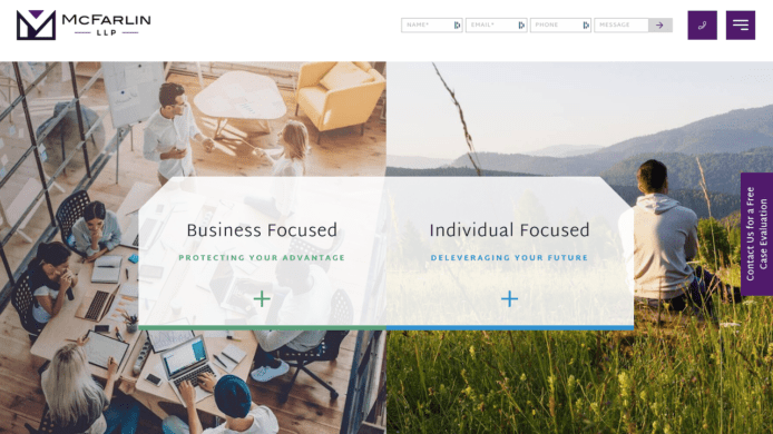
McFarlin LLP’s website uses its front page to highlight that it serves both businesses and individuals in everything from class action defense to personal debt elimination. The color scheme of the front page continues, with the bright blue representing the firm’s core individual services and the bright green the business ones. It helps tie together what could otherwise feel like a disparate group of practice areas.
When it comes to content marketing, McFarlin has gone above and beyond, with hundreds of entries stretching back several years. The content often focuses on things potential clients might be worrying about, such as bankruptcy or foreclosure.
The “hamburger” navigation for the site is odd on a desktop, accidentally giving it the look and feel of a mobile-only site. Additionally, the hamburger triggers a slide-over, where the menu slides from the right-hand side of the site over toward the left. However, the menu sometimes gets stuck, blocking half of the view. Making a site difficult to navigate can deter potential clients.
10. TTLO Law
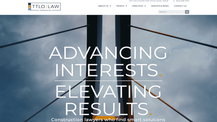
TTLO Law is a construction firm, and they make sure you know it with each building-themed picture. The site also displays a color scheme so subtle you might blink and miss it, but when you catch it—the orange of the punctuation echoing the orange of the logo, for example—you realize it was very carefully thought out.
If a bit more of that flair for color had continued across some of the other pages, it would help. The blog, though well-cared for in terms of adding content and highlighting the expertise of the firm, is in a grey typeface on a slightly darker grey background. Similarly, practice areas are explained with a typeface that’s just a shade too small, making it feel somewhat uninspired. Larger type and continued pops of color would hold a reader’s attention a bit longer.
[news-articles-list]

Share Article
Last updated January 25th, 2023
